Typography
The font we put in front of our members says a lot. In fact, it represents 3Hill Credit Union in a subtle, unspoken way without members even realizing it. When a brand identity is created, a consistent set of fonts should be incorporated—each with a specific purpose. Typography allows us to build an atmosphere and create a personality just by choosing the right typeface and arranging it strategically.
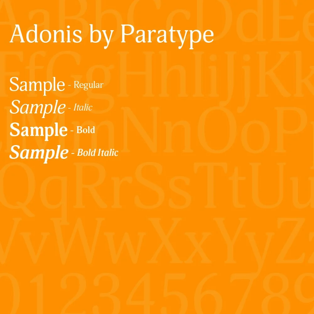
Adonis by Paratype
-
Available via Adobe Fonts
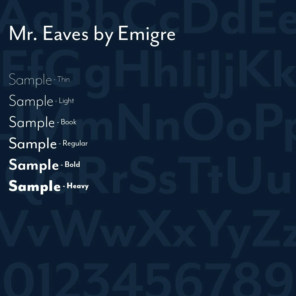
Mr. Eaves by Emigre
-
Available via Adobe Fonts
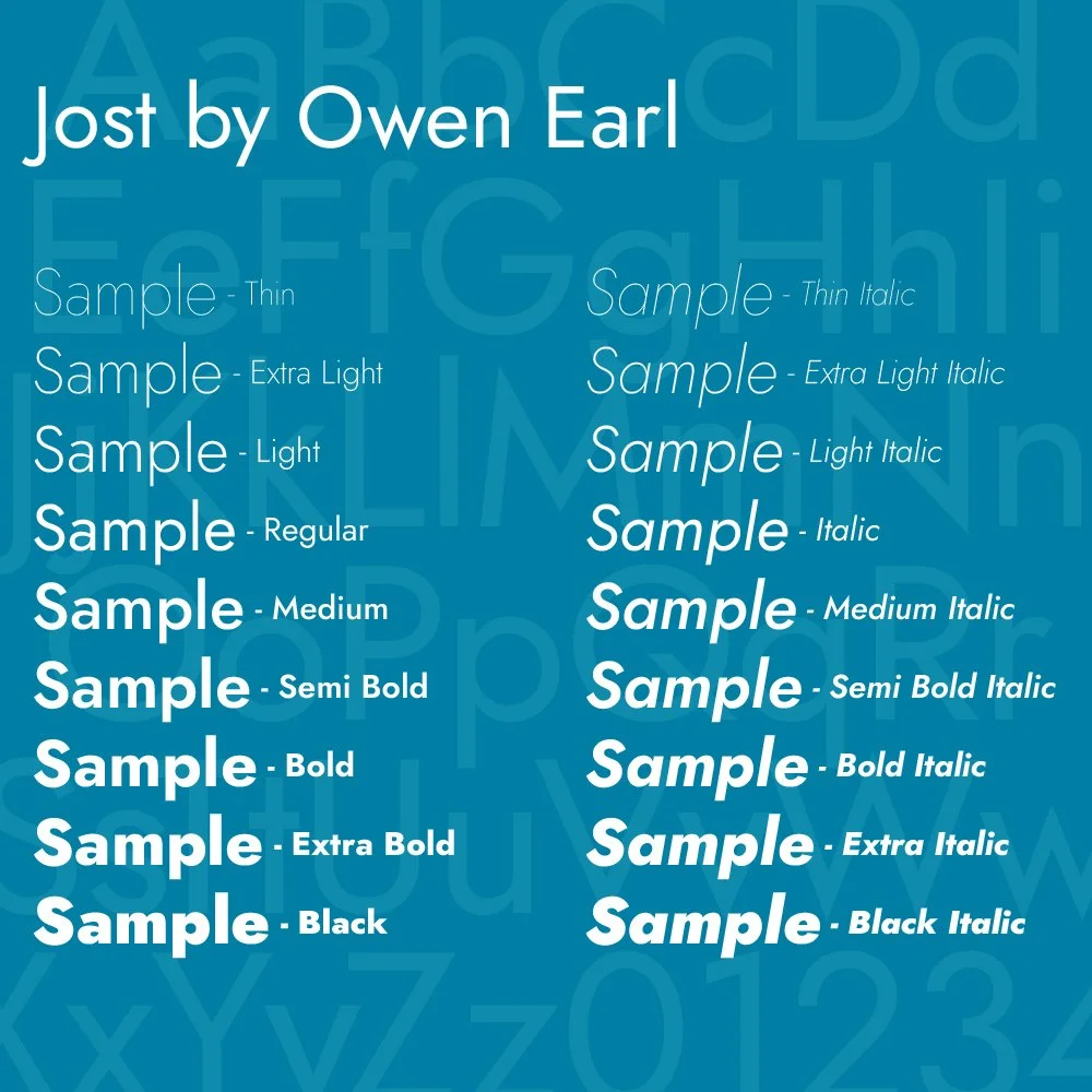
Jost by Owen Earl
-
Available via Google Fonts


